MVP Development
After designing our "first concept" prototype, we started to collect feedback from the client, our project manager and the project team. The next step of the process was creating a Minimum Viable Product – this iteration contains the core functionality and layout of the prototype, but needs a few final touches before it can be piloted.
A key takeaway from our critique sessions were that the content comfort level scale may be distracting. We needed to simplify the screen. CMU also frequently runs workshops that involve breakout rooms. Designing breakout room functionality became another priority for creating the MVP.
Redesign #1: Splitting up the Features
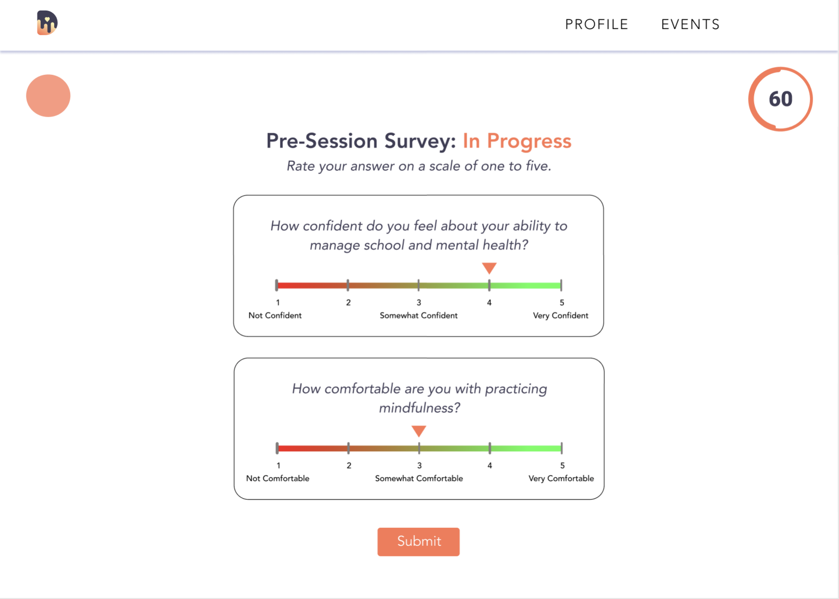
The content comfort scale had to go from the page, but since the client liked the feature, we considered other areas to place it. CMU breaks down their workshops into three sections: pre-session, mid-session, and post-session interludes. Installing the scale in these breaks would allow facilitators to view how participant understanding fluctuates and develops throughout the workshop, while keeping participants from getting distracted by the scale during presentations.

An example of a pre-session survey for a wellness workshop. Similar screens with the same questions would be presented at the mid-session and post-session breaks to collect info. on how participant understanding is developing.
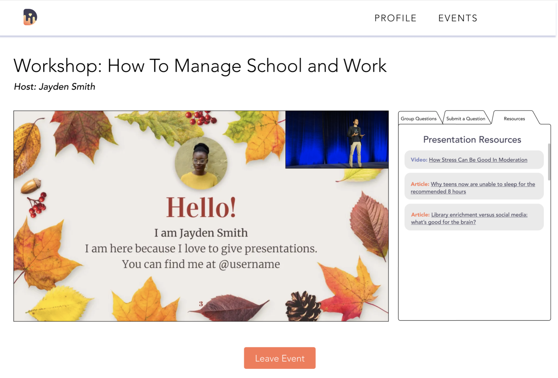
The main presentation screen was tweaked, with the addition of a few other features at the client's request. The main addition to this page is the "Resources" tab, that allows participants to access resources shared by the facilitator.

The updated presentation screen with a preview of the "Resources" tab.
Redesign #2: Creating the Breakout Rooms Experience
Break-out rooms retain the same basic structure of the regular presentation screen with a few tweaks.
Broadcast Message allows the facilitator to share a message across all breakout rooms; this can be used as a discussion prompt or reminder.
Updated menu includes key controls for participants during the breakout session.
As seen above, breakout rooms offer additional user controls. Users have their cameras off by default during regular presentations, but they're switched on for break-out rooms. Thus, a "Mute" and "Turn Off Video" option is available in the rooms.
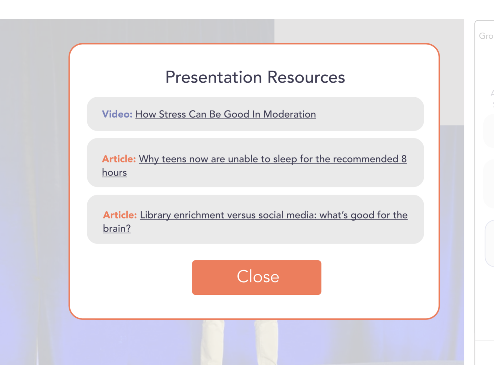
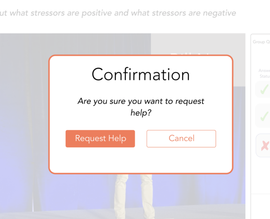
In addition, "Show" Resources" and "Ask for Help" are pop-up integrations added to let participants reference resources during the session, or ask the host to join the room for help.

"Presentation Resources" view in break-out rooms.

"Ask for Help" pop-up confirmation. Redesign 2.5: Breakout rooms – Host View
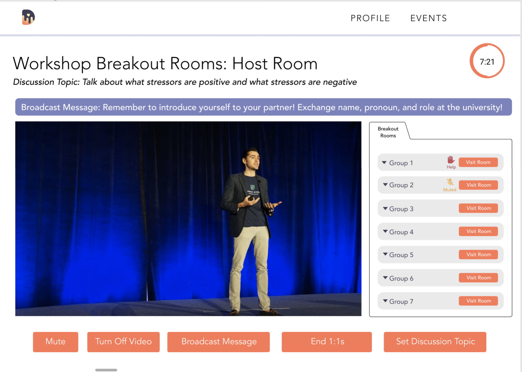
Of course, we also needed to design what the facilitator/host will see during break-out rooms. The "Host" view for the breakout rooms provides key controls, such as broadcasting messages, ending the breakout session, and visiting rooms.

Let's briefly revisit Dawn's mission – our main goal as an organization is to build empathy. Empathy is best built when you can see the other person's face and hear their voice. It wouldn't be user-friendly to take away a participant's ability to mute or shut their camera, but then, how should we encourage participants to actually have a discussion with their cameras on?
The answer, we found, wasn't too complicated. When participants are muted or have their cameras off for a certain period for time, the workshop host is alerted and can then check on the breakout room. For example, the yellow "Muted" icon on the left indicates that all participants in that room have their mics off.
In a similar way, the workshop host is notified that a user has requested "Help" by the red icon on the left.


