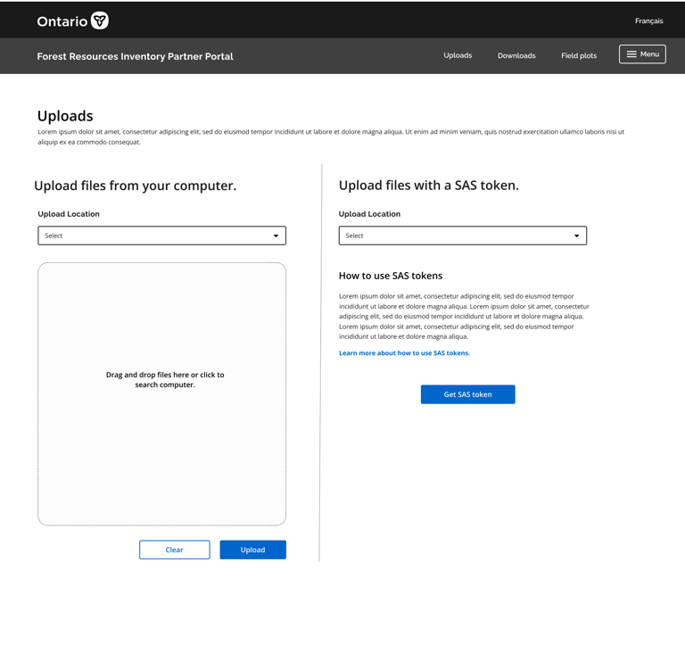
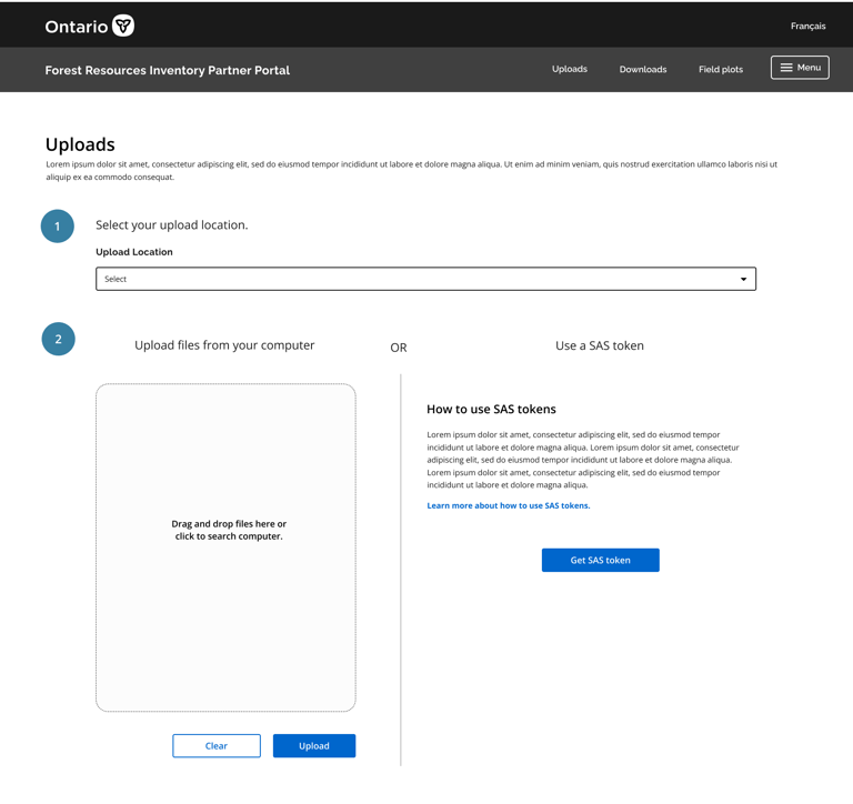
Forest Resources Inventory Partner Portal
The Department of Fisheries & Oceans (DFO) needed a unified design resource for their designers, developers and product teams. This is how my team helped them find a way forward through the chaos.
The Goal: Design a portal for Forestry partners.
The Forest Resources Inventory (FRI) team did not have an easy way for their partners to share, upload and request data. The current process was driven by sending hard drives to the FRI team, which could take up to weeks to process. This project recognized the need to transition to digital data transfer. The business team identified three priorities:
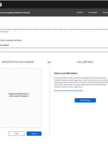
Data upload and search.
Priority 2
Efficiency is key.
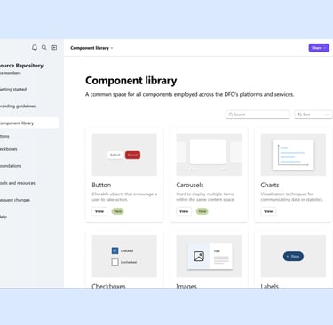
The DFO did not have a designated design library. As part of the Federal Government,
The DFO did not have a designated design library. As part of the Federal Government,
The DFO did not have a designated design library. As part of the Federal Government,
Defining the architecture
The first step was understanding the functionality and relevant pages that the portal needed. Abstractly, the team knew they wanted specific features such as a data uploading option. My job was to understand how to design and conceptualize these functions across a multi-page, internal web platform.
Exploring different layouts...

We know DFO employees are getting overwhelmed by the lack of clear guidelines and numerous design resources in Government. Now we need to identify where we can remove this confusion in their current workflows.
Time to make some storyboards!
I created two storyboards to outline optimal workflow for two different types of DFO employees: developers and designers.
The final decision:
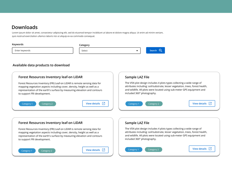
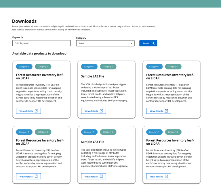
These mockups were designed to test how much information was more useful to see on the Downloads page. The first option can provide more detail in the description area, while the second option aims to incorporate more search results.
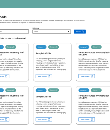
Download Data Products Pages
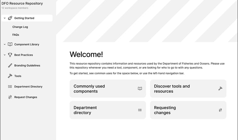
These employees would benefit from a unified system that can provide them with guidance and clarity on how to create consistent products. Based on discussions with our participants and stakeholders, the best way forward is to develop a design repository.
Download Data Products Pages
The business team and FRI partners preferred Option 2. Seeing more download results at once was a priority, which was better accomplished with the second option.
Option 1: Detailed search results
Option 2: Additional search results
Download Data Products Pages
These mockups were designed to test how much information was more useful to see on the Downloads page. The first option can provide more detail in the description area, while the second option aims to incorporate more search results.
Designing the System
This is where the fun happens– we started with some low-fidelity wireframes to get flesh out our initial ideas.
A low-fidelity wireframe of the design repository’s landing page.
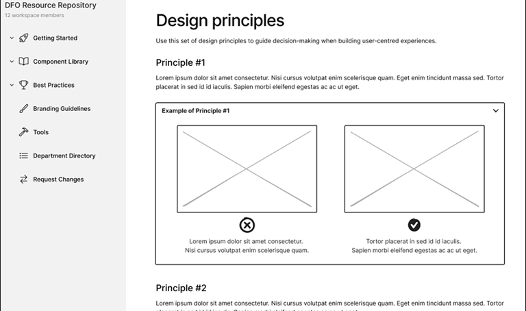
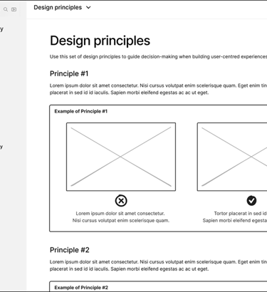
A low-fidelity wireframe of the design repository’s “Design Principles” page.
Testing in 3...2...1...
Moderated usability testing with six participants – including designers, developers and QA testers – yielded some useful results. We provided our participants with tasks to complete with the low-fidelity mockups and found that:
71.93% Overall Success!
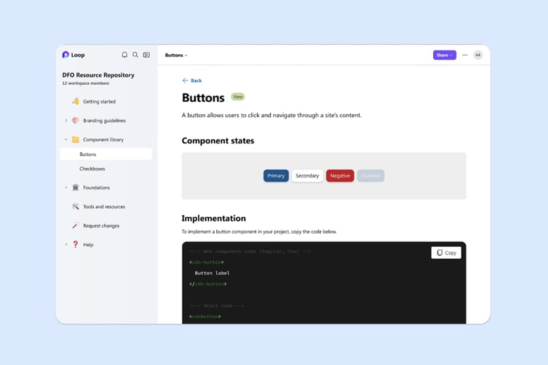
Tasks involving pages such as Request Changes, Directory, Branding Guidelines, and Component Library pages had the most success.
14.04% Partial Success.
Additional guidance was needed when navigating Best Practices and Accessibility page/content– in other words, we had work to do.
14.04% Overall Failure.
Understanding and navigating to the General Best Practices page had lowest task success rate. This was an important insight– this user flow needed a lot of fine-tuning!
Unmoderated mid-fi testing
We implemented testing feedback and adding visual styling to upgrade our mockups to mid-fidelity.
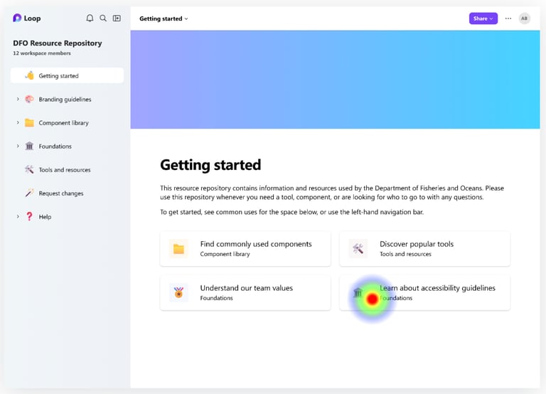
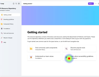
Using Maze, we invited seven participants to complete unmoderated user testing so we could measure where users click, how much time they spend on a page, the paths they take to reach a goal (direct, indirect, or failed), and more.
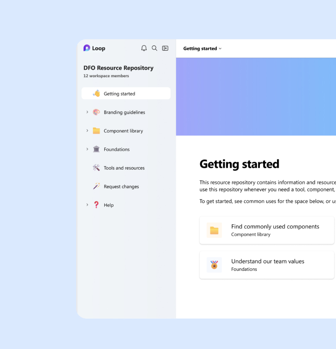
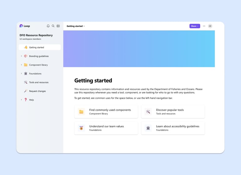
This helped us identify how effective the position, labelling and functionality of features are on the page. For instance, the quick links on the Getting Started page was used by most participants to find accessibility guidelines. This informed us that users may benefit from having access to commonly-needed features in the design repository through quick links.
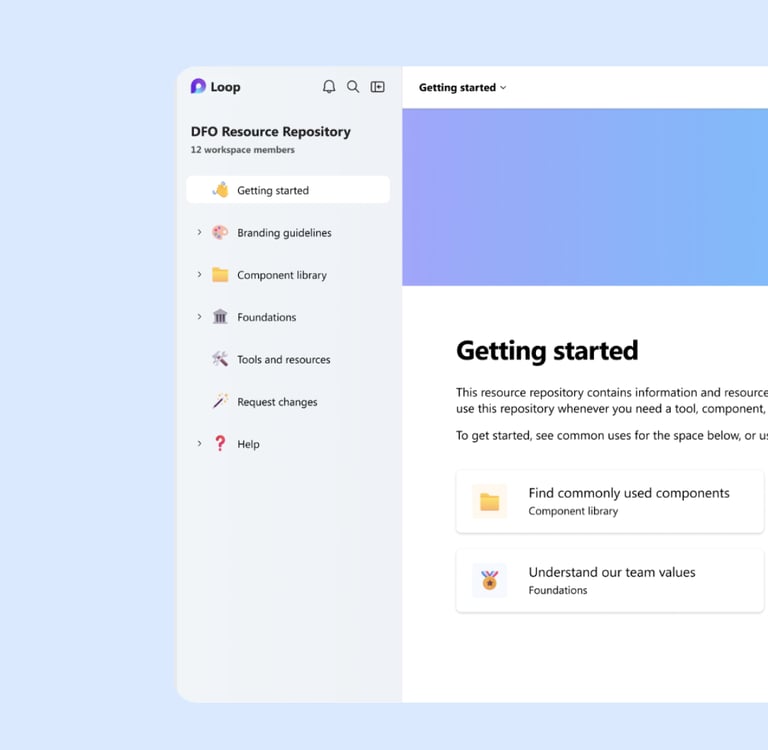
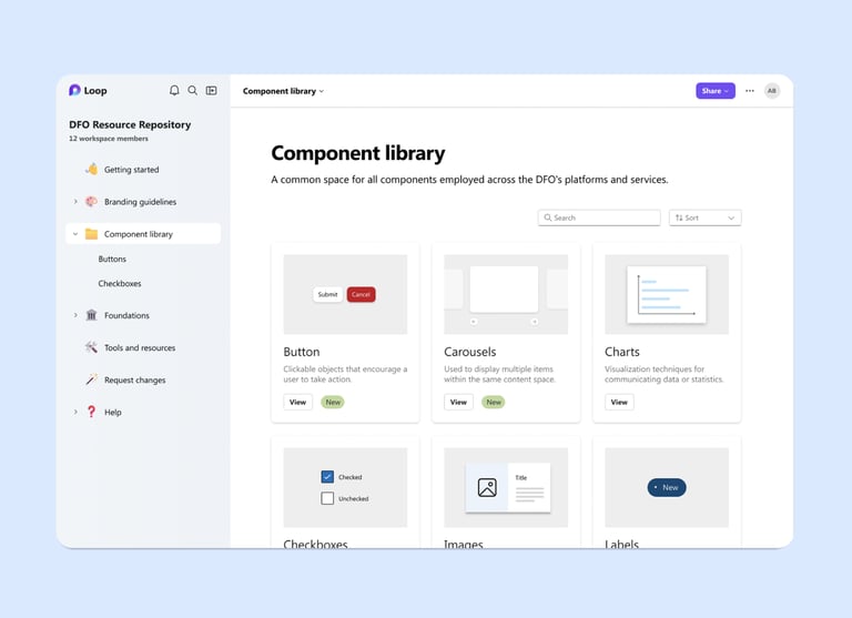
Let's wrap up with a high-fi product!
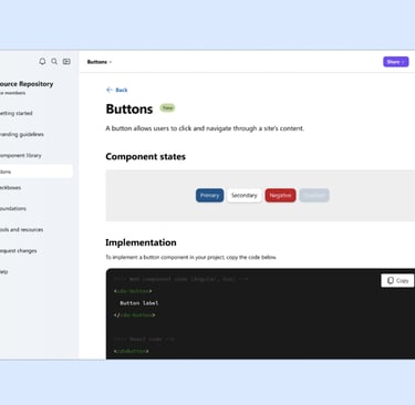
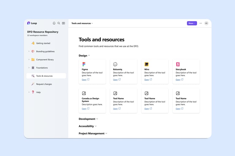
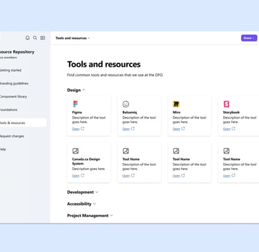
Before the curtains close, let us present our grand finale. Here is the final product – a Design Repository for the Department of Fisheries and Oceans.
Lessons learned...
This project demonstrated how consistent user research can help me deliver digital products that are responsive to users' needs. Having said that, if I were to do this project again, I'd be interested in exploring opportunities to leverage co-design. I believe there is an opportunity to engage with others outside the project team – such as the Department's employees – from earlier in the design cycle through co-design methods. Stay tuned to the next project where I apply this finding and implement co-design into my process!
ALL Icons from flaticon.