GeologyOntario Search Portal
Modernizing the discovery and access of geoscience data for clients served by the Ministry of Mines.
ux designer | website design | MAY 2022 – mARCH 2023
The Problem: Everything is outdated!
The GeologyOntario project was developed with the objective to create a new internet data discovery site for the Mines and Minerals Division (MMD) to allow clients such as Geoscientists, and Consultants to search, discover and access MMD geoscience information. At the time of the project, the existing website to access geoscience data had maintained its interface as designed in the early 2000s.
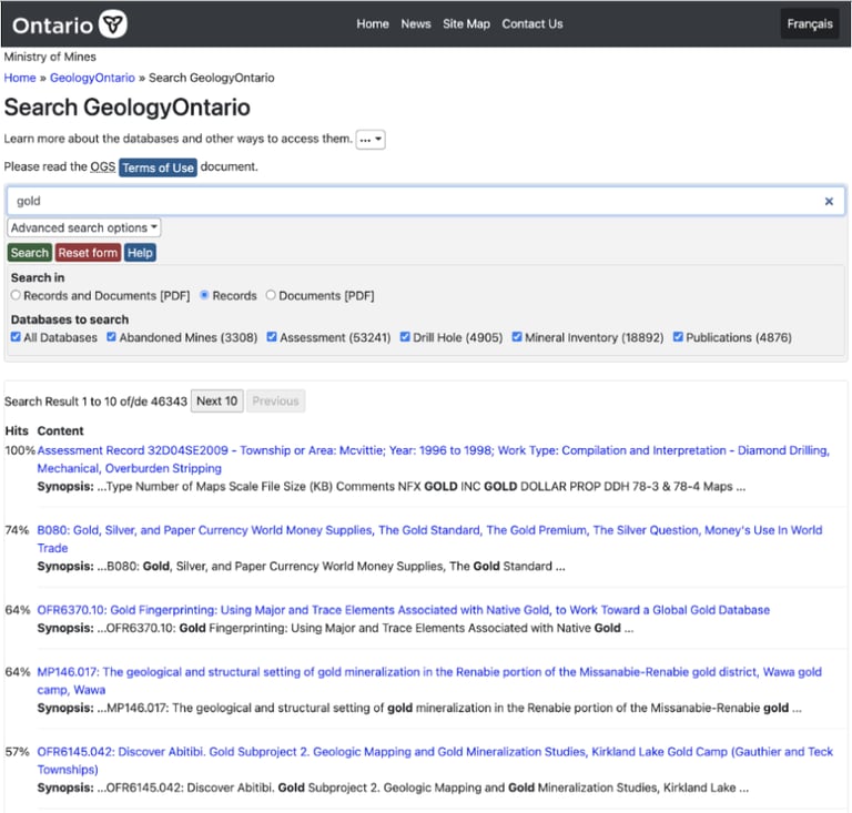
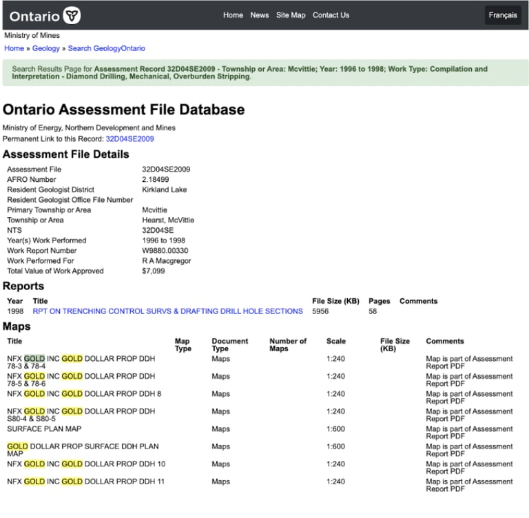
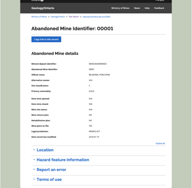
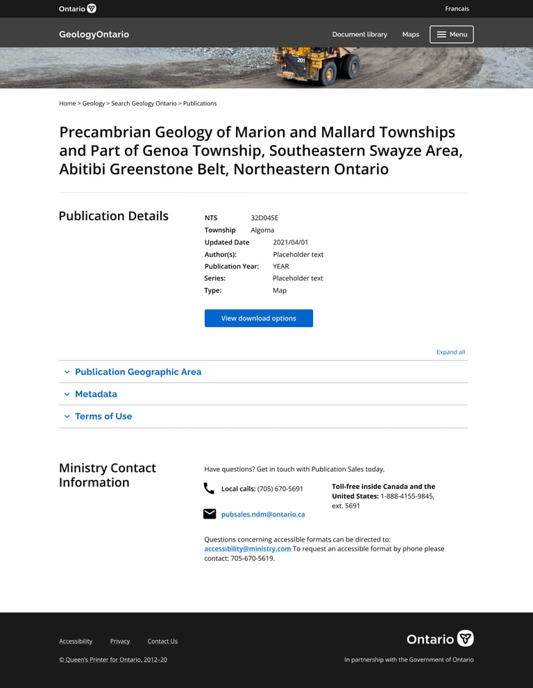
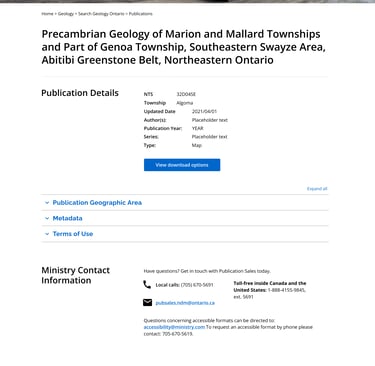
Search result page on the old GeologyOntario website.
An opened search result page on the previous GeologyOntario website.
Initial problems...
Some initial problems that our design and product teams observed:
Poor visual appearance – branding was inconsistent with other Ministry pages and consisted of overwhelming text for most users at first glance.
Mismatch between system and users – Terminology on the search result page was confusing; most users were unsure what “hits” meant and why results were sorted according to them.
Accessibility concerns - The website was not fully accessible according to WCAG
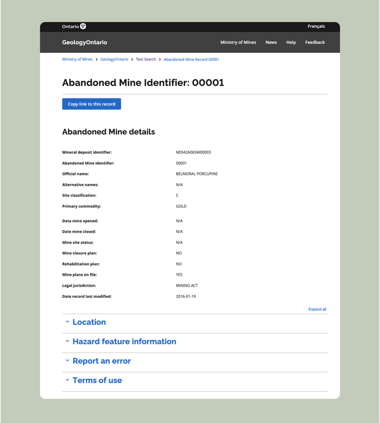
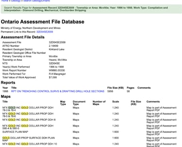
Default View of the old GeologyOntario search page
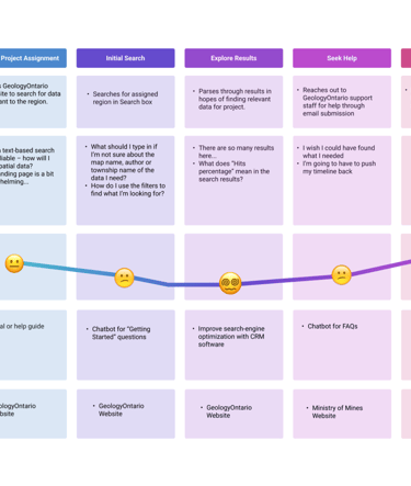
Let's look at the current user journey...
Based on existing user research data collected from earlier research, I developed a customer journey map that outlined the existing user journey for users of the old GeologyOntario website.
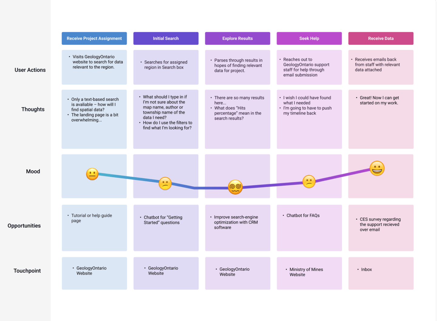
The evident challenge:
The GeologyOntario search result page raised the highest level concern: the search results were simply too confusing to read! Making the process to search for data needed to be simpler.
While our team recognize the need to address the initial problems we identified, it was important to consider the user perspective in the current system – as well as the pain points we needed to addressed.
Designing the System
As the sole designer on the team, I was able to experiment with mockups, design new features and collect user feedback to develop designs that cleaned up the search process.
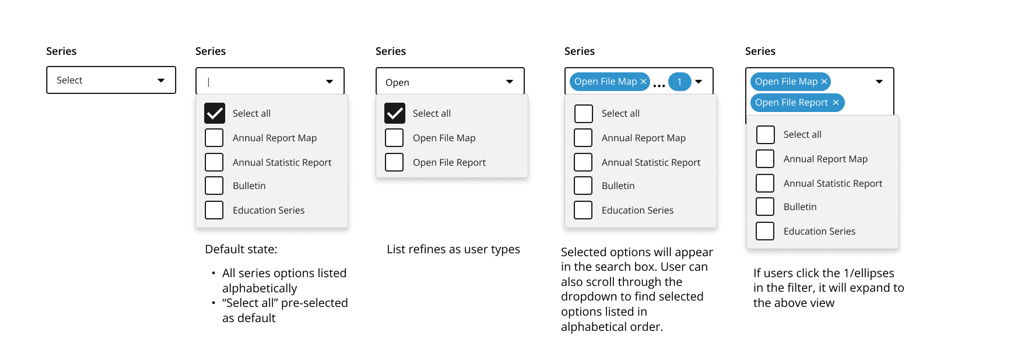
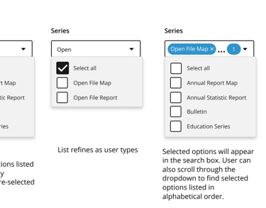
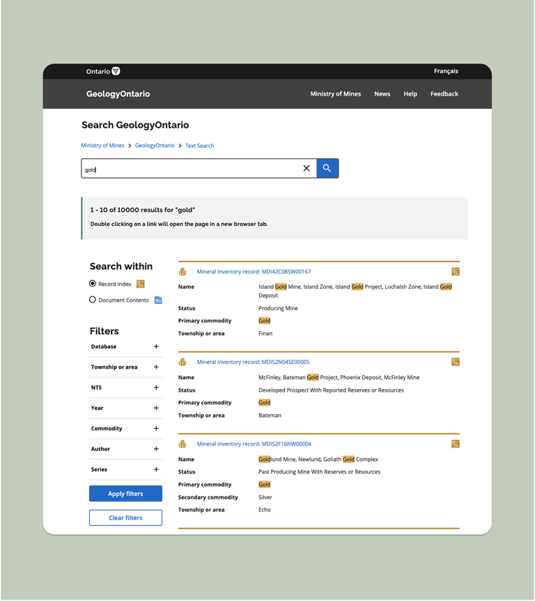
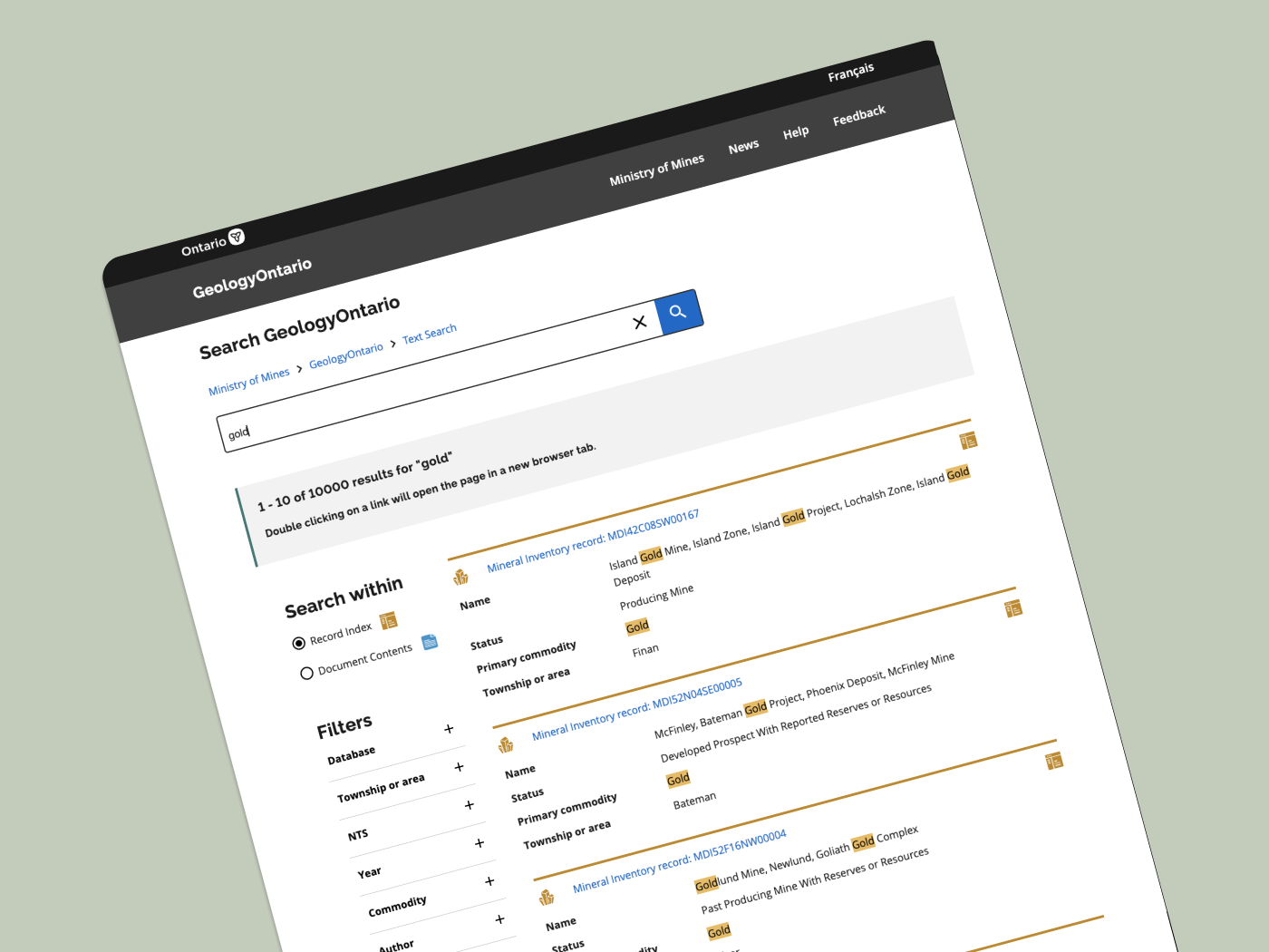
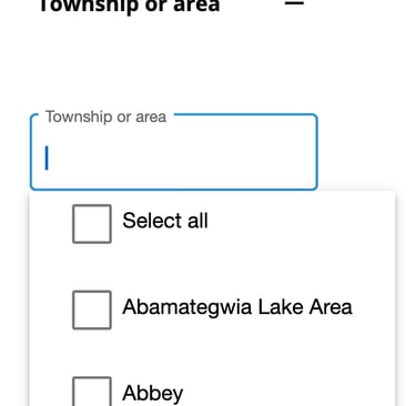
The filter component broken down step-by-step .
UPDATED FILTER CATEGORIES, represented in a side menu bar
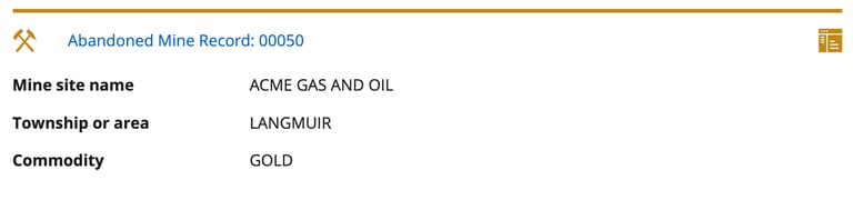
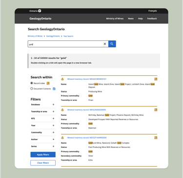
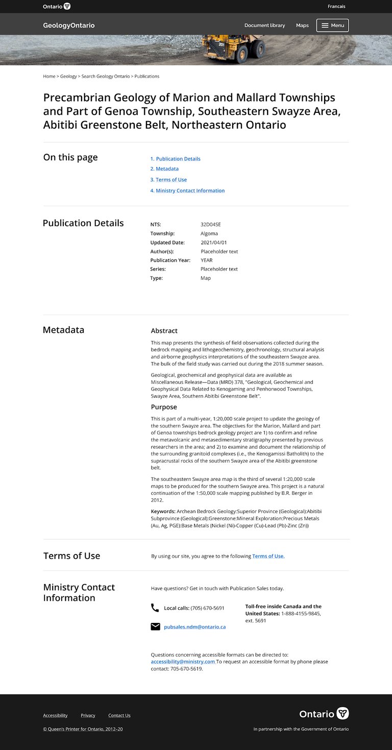
a Comprehensive search result
For example: website visitors often needed to find very specific files. In order to make the process easier, I designed a step-by-step filter component that lets users select the exact categories they are searching for.
In order to make the search results easier to read at a glance, I leveraged icons and colours that corresponded with the search filter options, as well as a clear label system that broke down important search criteria.
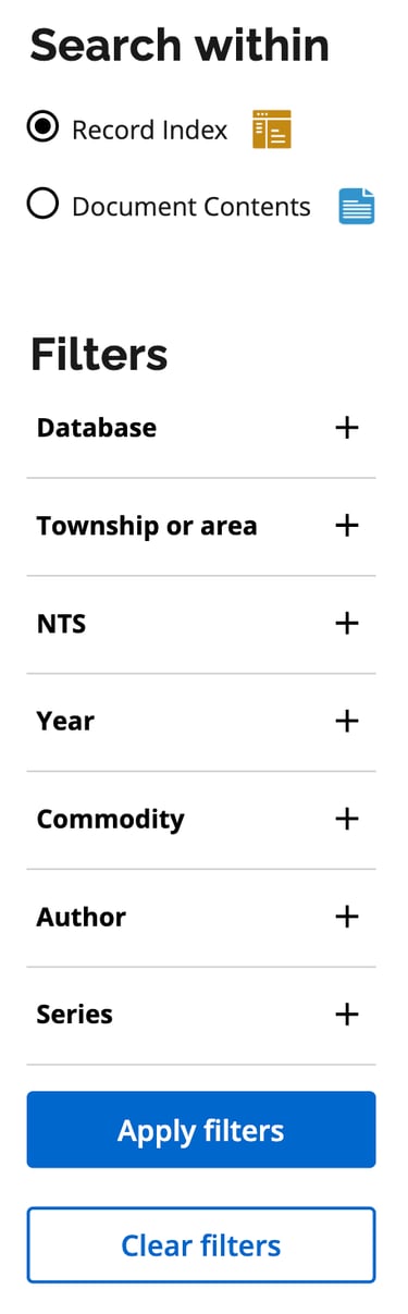
To represent these filters, I applied the UX heuristic principle of Consistency and Standards. Essentially, a sidebar to showcase all available filters would be better aligned with what users would expect from a search page in contrast to the original condensed filter options below the search bar.
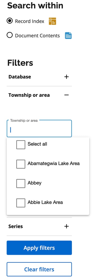
A clean and comprehensive filter component
A sidebar where users expect it
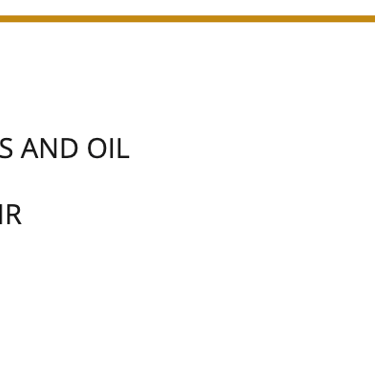
A search result you can skim
Time to put these features to the test!
Insight: less is better!
Our hunch that users would prefer a clean, expandable accordion was proven correct. Being able to view key information on the page and quickly find what users need was more important than being able to use the search function to find specific words.
Presenting the final product!
Following adjustments from user research, we published my designs. You can view the designs on the official GeologyOntario website here.
Lessons learned...
This project offered me a new perspective into UX/UI Design; this was the first project where I designed upon an existing system, rather than from scratch.
One important insight from this process was that it's extremely important to understand your users. Especially when your users have been using the same system for more than a decade. Any changes I made to GeologyOntario's interface would be compared to the old model, which may have been outdated– but remained familiar to our users.
User feedback was key to the design journey. Going forward – on interfaces that are built anew or update old systems alike – I aim to capture user feedback actively and consistently. Indeed, the user's perspective makes all the difference.
After creating these features, it was time to see what worked for users. Part of our testing process including offering users different options to find their desired information. User research participants were asked to complete a series of tasks and rate their preferences across different interface options.
Option 1: Accordion menu
Option 2: Full page view